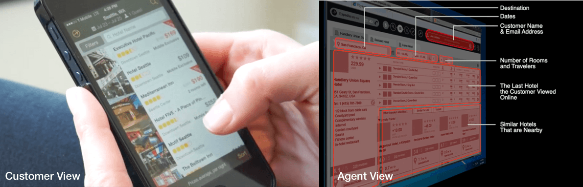
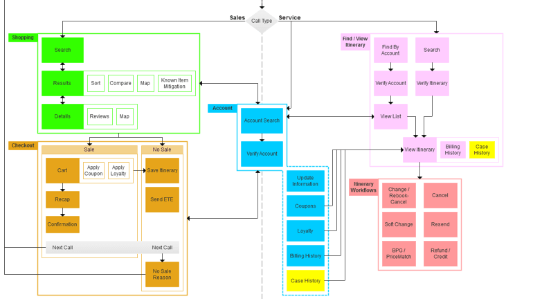
My team at Expedia worked on technology that gave call center agents access to see important information about the customer on the line before the start of the call.
This solves a lot of problems for agents: They’d no longer have to struggle with complicated American names, they’d be able to make calls shorter and take more calls in less time, customers wouldn't have to read aloud long itinerary numbers, and wouldn't have to wait for agents to switch systems once they know what the call is about.
I was the lead UX designer for this project, and needed to figure out how to design the greeting with this new information at hand.
Research
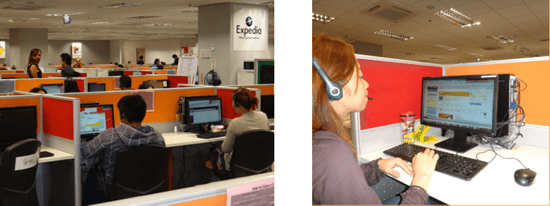
In order to figure out how agents greet callers today, I visited two big call centers in the Philippines, and spent the days interviewing agents and listening to agent-customer conversations. While I always thought we need to help agents guide customers to find the best hotel in their destined location, during this research I learned that 95% of callers know exactly at which hotel they want to stay. This kind of information can have a big impact on how an agent starts a call.
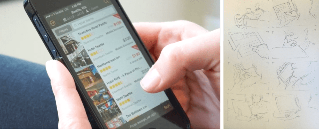
First Prototypes

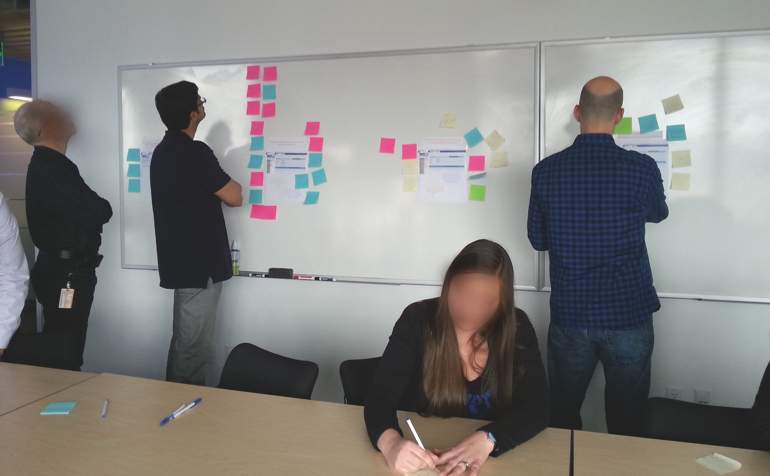
Back in Seattle we worked in weekly sprints, experimenting with different design directions. I needed to figure out where in the UI to place the information about the caller, so that the agent can comprehend it quickly, before the start of the call.

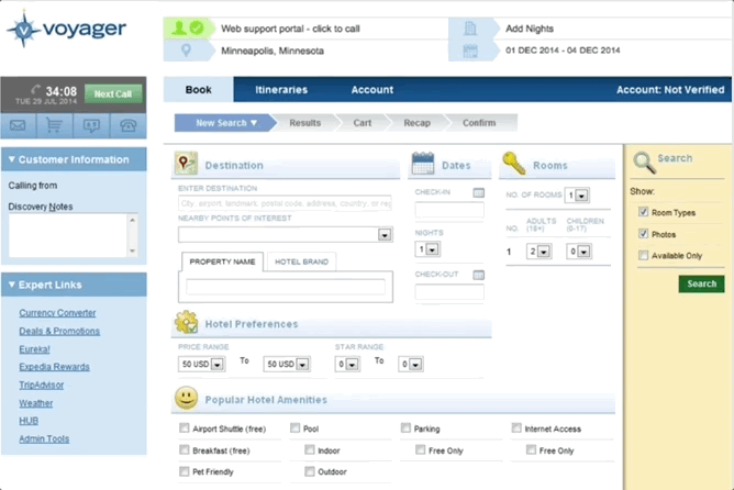

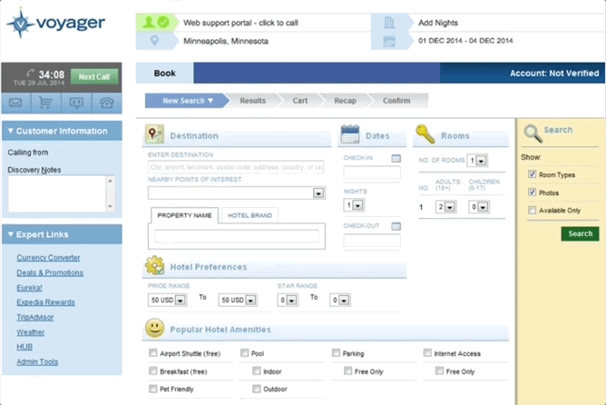
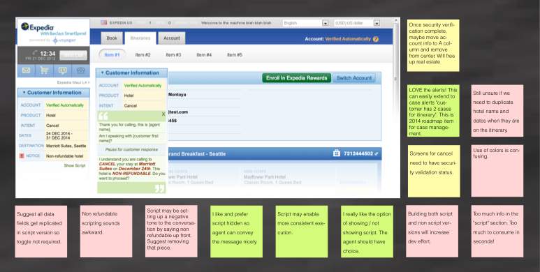
All the placements I tried above did not work, either because they required another click, were in areas that take longer to load, or were dependant on information we didn't always get. After several iterations it became clear that the information about the caller should be displayed in the left column - it is the quickest element to load on the page, it’s the first thing agents are used to checking as they prepare for a new call, it’s where they see where the call is coming from and where they have access to quick links the customer might be asking about.

My AHA Moment
While working on this project, I attended the UIE conference organized by Jared Spool, and participated in Kim Goodwin’s workshop about scenarios. Suddenly I realized, we’ll never have a good design unless we test a full scenario, including what the caller feels about how the agent greets her. What if callers think it’s creepy the agent knows so much about them before starting the conversation?

I set myself a goal to change the way my team works. From now on, it won’t be enough to just test our designs with agents, we need to test how customers respond to that conversation.
My biggest challenge
Coming back from the conference, I faced a huge challenge: getting upper management to spend time and money on research our group has never done before: with end customers. We’d need to hire a recruiting agency, design a research plan, invest in new research software, and use a lab.
Enlarging the budget was not something my executive wanted to hear about, especially as they thought things were working well as they were. So I started inviting them to presentations, where I took Kim Goodwin’s framework and told stories using scenarios an Expedia customer would encounter. I also built prototypes that simulated my stakeholders as the callers and invited them to silent meeting sessions to gather feedback. Eventually, I managed to convince the head of our division to allocate resources and give it a try.


Testing a full conversation
For the first time ever in the Global Customer Operations team at Expedia, we tested our designs not only with agents, but also with the people who call our agents. We used an external recruiting agency to recruit people who have contacted customer support at least once in the last 6 months.
What we learned
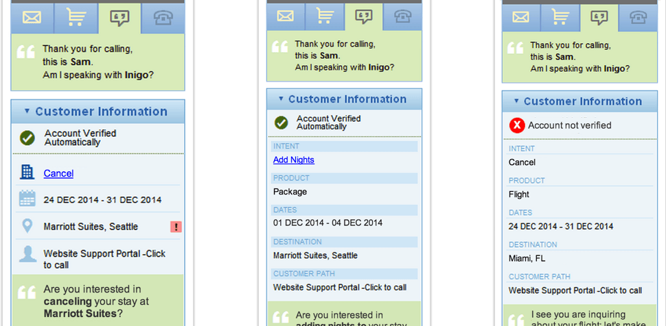
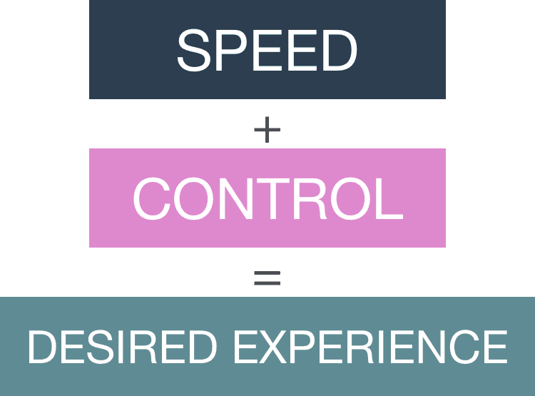
Customers, just like agents, want to be in control. Some people assumed the information an agent has about them is based on the number they were calling from and feared anyone can just pick up their phone and change their itinerary. On the other hand, it was clear the call was fast and painless when the agent knew ahead of time what it was about, and people loved that.
Giving customers control
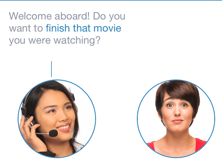
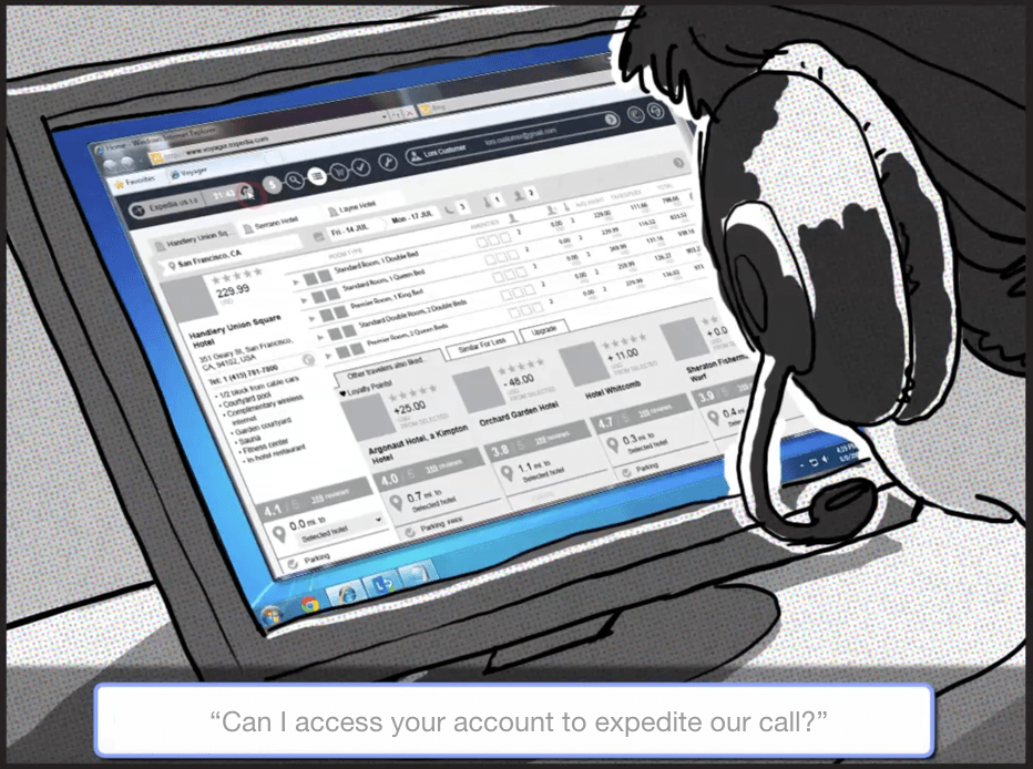
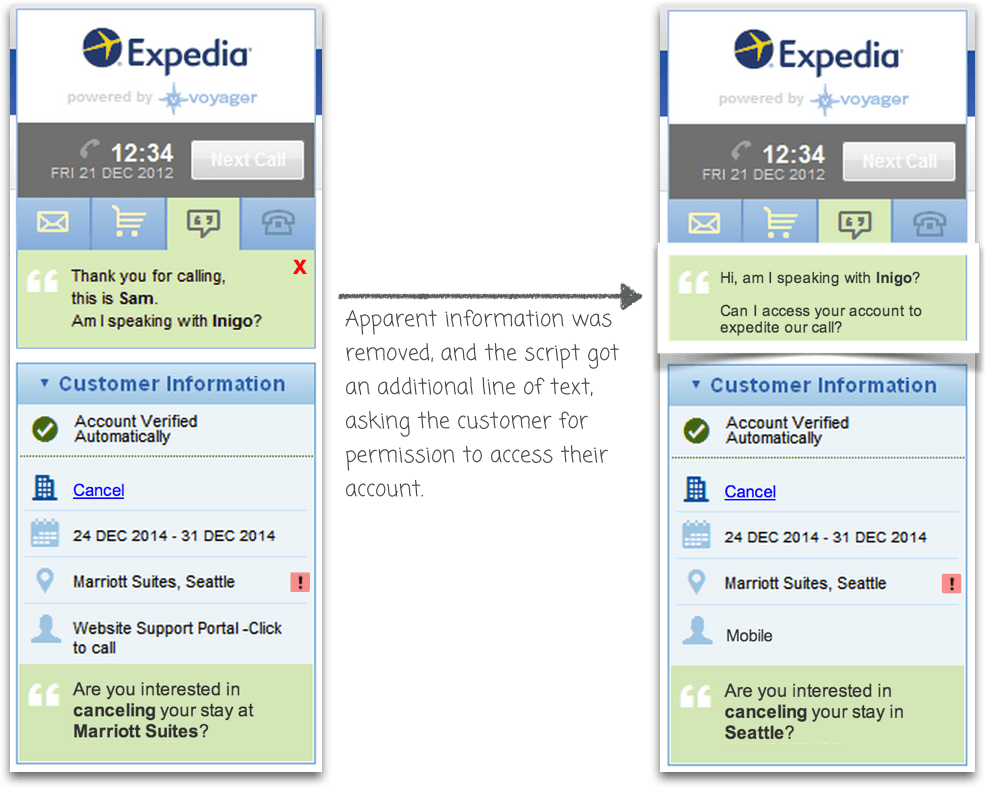
For the next usability session, we changed one line which proved to be a winning decision. Instead of the agent going straight into the conversation, they started with a simple question - ‘Is it OK for me to access your account?’ This question removed the feeling that the conversation starts like a 'big brother' that knows what you’ve been doing. Even though this question adds a bit more length to the call, it creates confidence for callers and freedom for agents.
Giving agents control
Following this research we also learned that the best design is giving agents just enough information so that they can compose an opening themselves, without giving them exact word-by-word script, as that made them feel constrained. That balance of just the right amount of information let them feel empowered and in control of the conversation.
The new research method we practiced in this project led to a whole new design process within the Customer Service team at Expedia, a process that proved to be more satisfying for both agents and customers, reduced call times, and saved a lot of money for the company. We went from 66% call resolution to 80% call resolution and reduced the average call time by 34 seconds. After 3 months I was rewarded ‘Product Hero’ and Expedia still uses this design approach today.
A new look to Expedia Agent Tools
This end to end research led to more design changes. Since we discovered 95% of callers already have a hotel in mind, we redesigned search results so that instead of showing a long list of hotels, we now show the ONE hotel a customer was viewing online, and present it in a way that allows agents to easily offer alternatives.
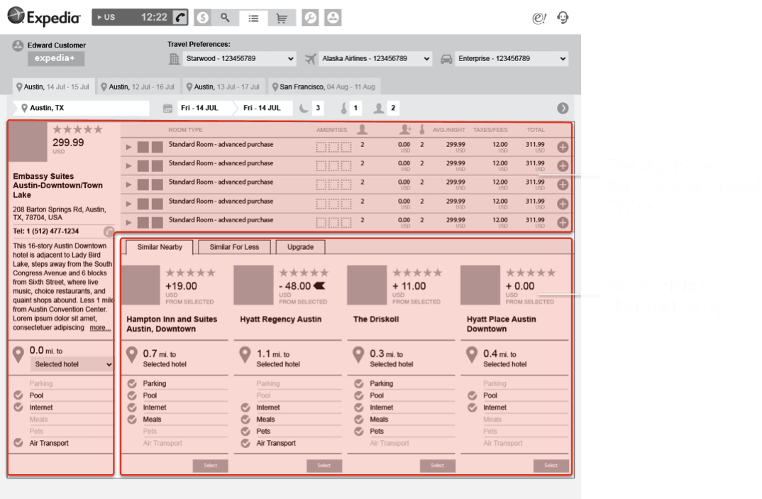
The new design offers an easy way for an agent to value one result over another based on a customer’s preferences, and easily compose a sentence: ‘compared to the hotel you were thinking about, here is a cheaper / closer / fancier one with similar amenities’.