PICK A VERSION
SUPPORTING CUSTOMER COMPREHENSION OF SIMILAR PRODUCTS
My role at Amazon is to design the experiences that help Amazon customers choose, purchase and use Amazon devices. This is a story about how I used design to help our customers make the right purchase decisions for themselves.
We have quite a few products that look very similar to each other. Echo Dot and Echo Dot with clock are a good example, because they look almost identical to each other, so it can be confusing to understand the differences between them, and decide which one to buy. In fact, we’ve seen many customers actually make the wrong purchase, they bought the version they didn’t intend to buy.
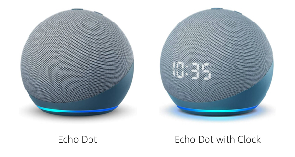

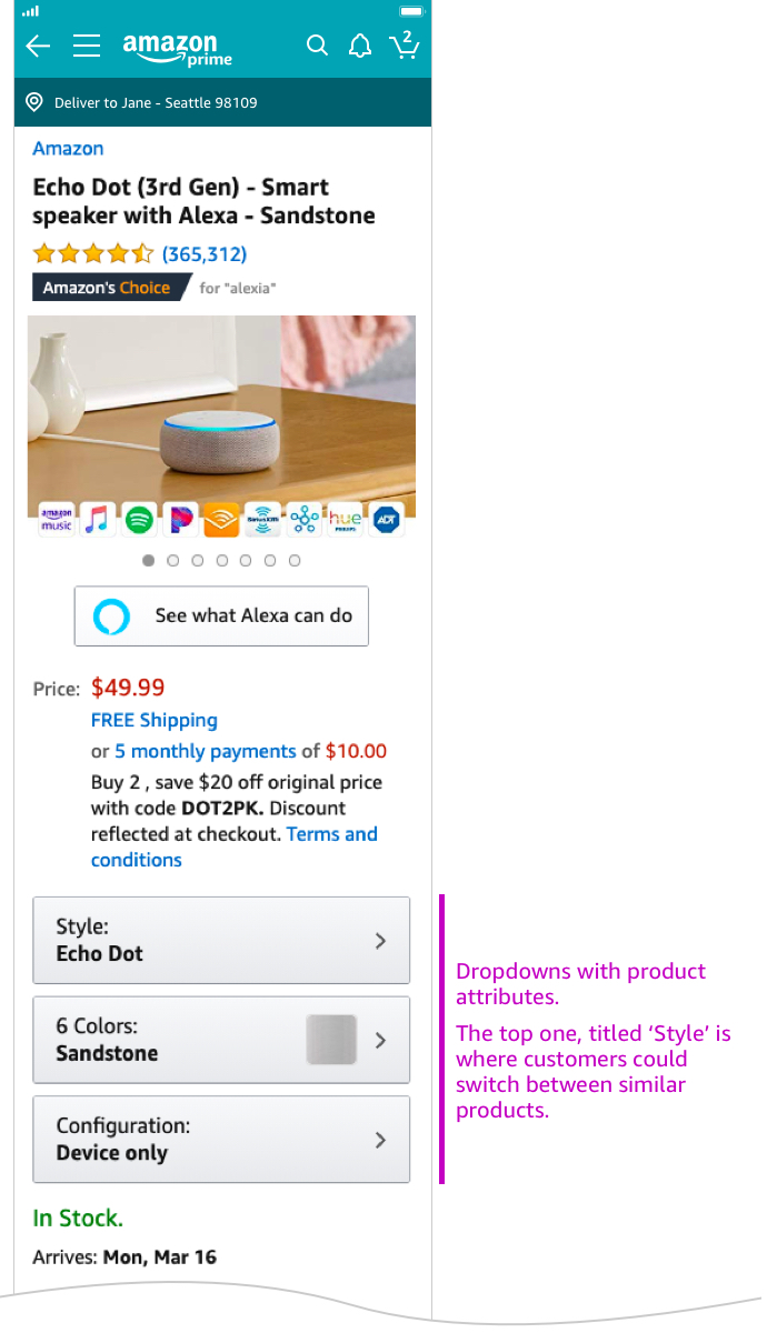
Digging deeper into the customer challenge, I found that the problem went back to the way the product pages were built. The different versions of similar products shared the same product page. Customers could toggle between versions the same way they toggle between colors. Through user studies, I realized there are several obstacles that make the purchase experience hard for customers in this configuration. For example, a consequense to sharing a product page is shared product reviews. Customers looking to buy an Echo Dot, read reviews for both the base device (Echo Dot), and the base device with a LED display (Echo Dot with Clock), without realizing they are reading mixed reviews of two different products.
This is how Amazon detail pages have been built for years. As the marketing folks told me, it's a great way to drive awareness to products that share similarities. And so, my first challenge, ahead of solving the customer problem, was getting other stakeholders in the company to see the value in investing resources to make such a fundamental change.
The data was not on my side. Our metrics showed that pages that used this toggle functionality increased discoverability, and sales of the similar, at times less popular products - went up.

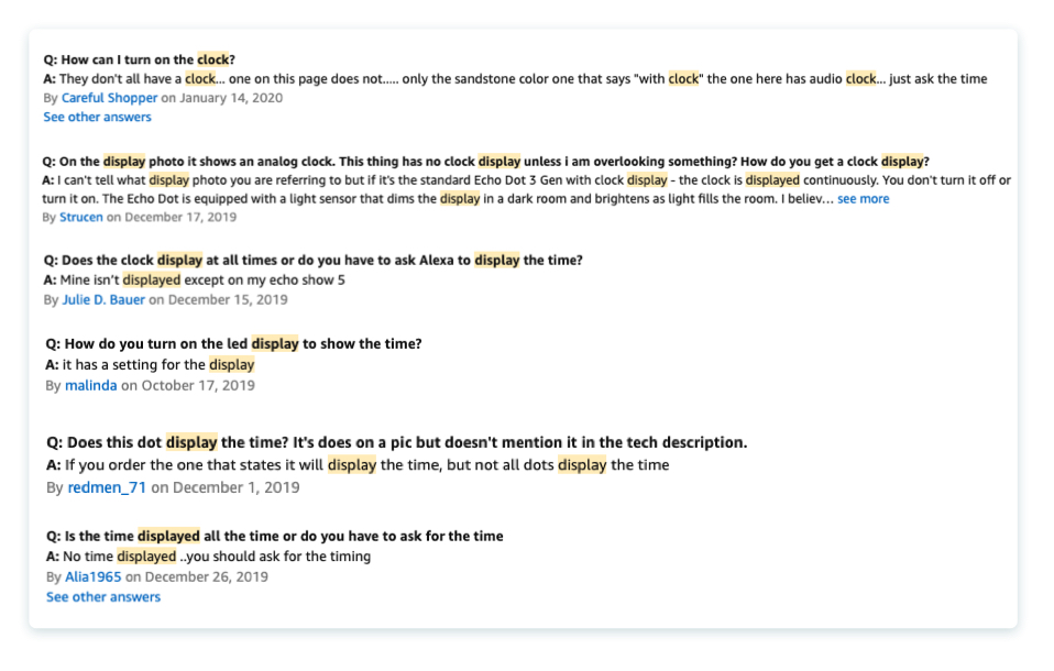
But the the annecdotes told a different story.
Reviews and Q&As on the page showed clear evidence of customer confusion. I found that customers were asking questions such as 'how can I turn on the clock?', when in fact they didn't buy the version with the clock. Echo Dot is one of Amazon's most popular products, so having people struggle with its purchase is a big problem for us.

Jeff Bezos famously said: "The thing I have noticed is when the anecdotes and the data disagree, the anecdotes are usually right. There's something wrong with the way you are measuring."
I decided to find a way to separate the detail pages, while not sacraficing the advantage of increased awareness that came with the previous design solution.
Furthermore, my goal was to solve other customer problems that came with the former page structure, such as -
(1) It would be important for reviews to be separated between products.
(2) Customers would need to clearly understand the differences between similar products, to avoid confusion and help them decide which version is best for them.
(3) All the similar products would need to equally appear in search results if the search term was broad enough. In the previous design, because similar products shared the same product page, only one variation would appear in search resutls.
I created a deck showing all the problems customers were having with the then-current design, and held personal conversations with stakeholders to show them the harm we are causing customers by using the 'Style' dropdown. After several conversations, getting stakeholders involved in initial sketches, and hearing and responding to everyone's point of view, I finally reached consensus to move forward with exploring alternatives to the 'Style' dropdown.
As I was working on making that experience easier, I took inspiration from journalism. If you open a newspaper and try to decide what article to read, there are several hints that guide you – there is a big header title, a subtitle, a little teaser about what the article is about – all before the reader has to decide if they want to read it.
But in e-commerce, you kind of go from search results to reading an article, and that can feel overwhelming. Especially when the products are new to you, and you need to decide between devices that have as little as slight differences between them.
After a few weeks of white boarding, sketching, and concept work in Sketch, I was able to start testing concepts with real customers.
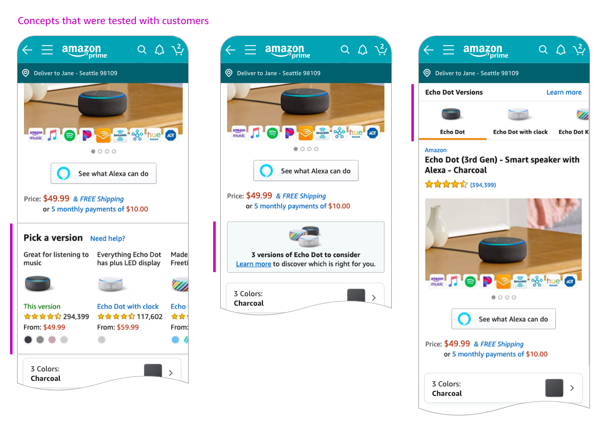

Analyzing the user studies, we decided to build Pick a Version, a widget that allows customers to see bite sized summaries of similar products, explaining what the differences are between them, and making it easier for customers to quickly scan through them and decide which one will be better for them. Clicking on each of the boxes in the widget opens a new product page. Each product maintains their own unique reviews, and all items equally appear in search results.
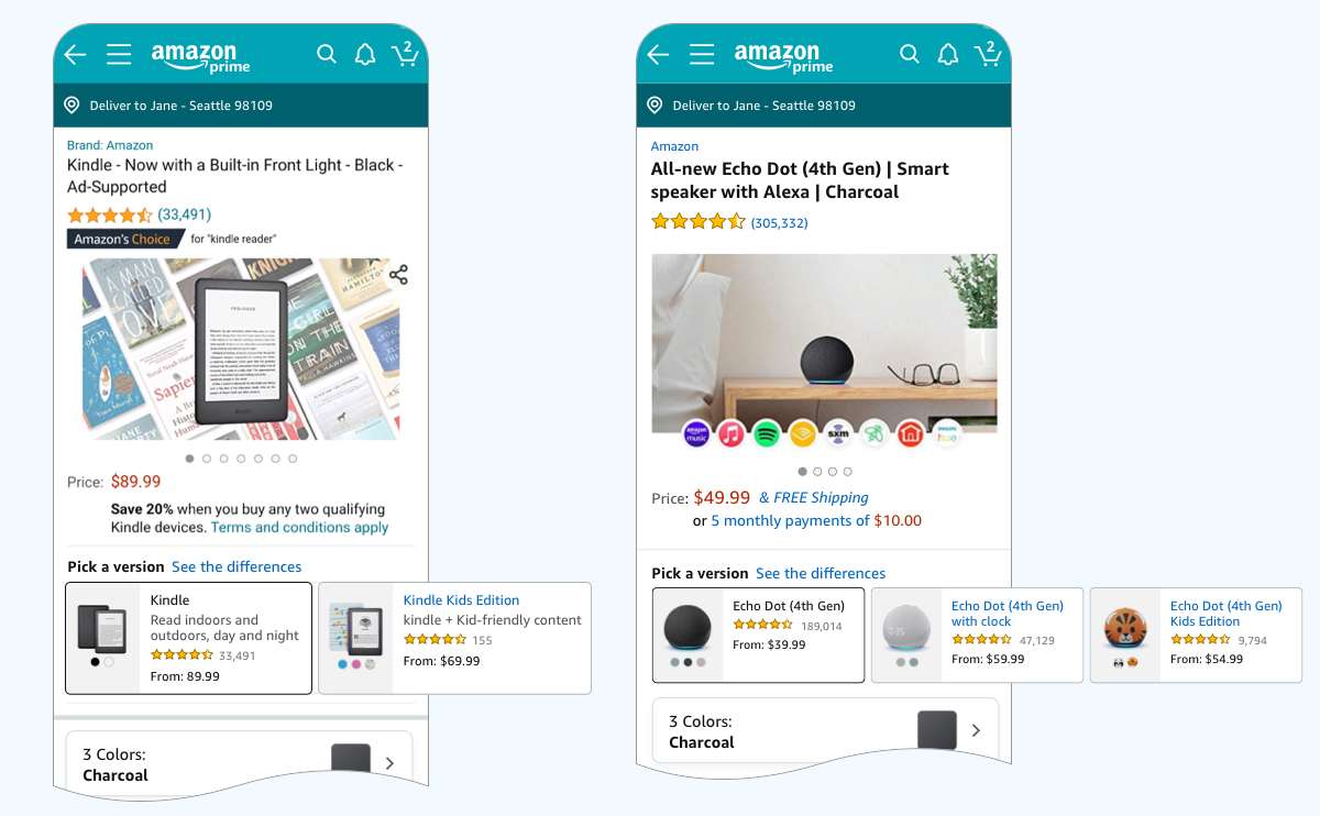

Clicking on 'See the differences' shows customers a quick scannable list of the core differences between the products.
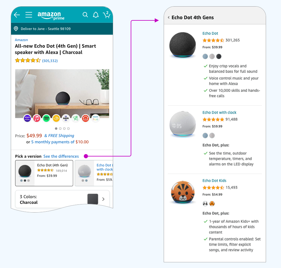

Pick a Version has changed the way people purchase these products. We launched the first version with Echo Dots and Fire TV Sticks, with positive results. By now, we’ve expanded this experience to many more product lines including Kindle, Fire Tablets, Ring devices and more, in worldwide marketplaces.
I’m excited by the helpfulness my work can bring to our customers, and that is what keeps me going.
